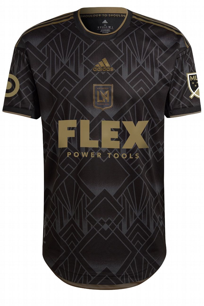
It wasn’t that long ago when Major League Soccer and Adidas came under criticism for unveiling a slew of white kits that could only be differentiated by subtle accents or team-specific Easter eggs hidden under the collar. That’s no longer the case, with 2022’s offerings bringing plenty of bold designs and unique identifying features.
Evaluating jerseys is subjective, though. There’s no science in this list — only opinion — but there are plenty of elements to be graded beyond simple aesthetics. For example, many of these kits tell a story, often taking inspiration from a local landmark or cultural touchstone. They lend an authenticity to the shirts, something that hasn’t always been the case, and those teams are vocal in calling out those inspirations with an origin story.
And that is something that will be judged upon in 2022: storytelling. Has your club’s jersey been inspired by your favorite tourist attraction or local haunt, or has a rather generic pattern been given an ill-conceived narrative to create the illusion of authenticity?
– Take note, Charlotte: The do’s and don’ts of MLS expansion
– Could Isco, Memphis follow Insigne to MLS as free agents?
– What latest big-name (or big-money) signings mean for MLS
So let’s get into it: here are all 28 team’s threads, ranked top to bottom, on their beauty, their originality and their ability to tell the story.
1. LAFC | 5 Years Strong | +12 from 2021
When LAFC revealed their club crest and branding in 2016, all of it dripping with Art Deco inspiration, it was a smash hit. Celebrating its fifth season in MLS, the club has returned to the style that became so synonymous with Los Angeles in the 1920s and ’30s, and to great effect. The monochromatic pattern shouts from the rooftops that this is still the it club that got the soccer world talking in 2018. I could do without the centrally placed club crest and Adidas logo, in favor of more traditional locations, but even that somehow works.

2. Portland Timbers | Heritage Rose | +23 from 2021
As much as I hate to say it, let’s put all the controversy around the Portland Timbers to one side for a moment and focus on the most unique jersey of 2022. The Heritage Rose kit’s floral print is a bold, but beautifully executed, way to pay homage to the Rose City, and the Vapour Pink and Victory Crimson make for a colorful experience unique within the league. It’s worth pointing out, though, that the Portland Thorns revealed a rose shirt of their own in 2020, to great acclaim. A special shout out to the women wearing those shirts for blazing trails the rest of the soccer community will eventually trod — if they haven’t already.
3. Orlando City | Sunshine | +15 from 2021
If you’re a fan of 2003’s Old School, I know what you’re thinking: “The Sunshine State. Denver. Gorgeous.” Sure, Luke Wilson was incorrect in his inebriated assertion that the Sunshine State was Colorado, but it’s the thought that counts. And Orlando’s Sunshine kit is nothing short of that: gorgeous. The shades of orange, gold and purple seen in the sunburst pattern that dominates the front of the jersey pay homage to the incredible sunrises and sunsets that bring so many to Central Florida.
Raise your hand if you knew Atlanta was known as “the city in the forest.” Me neither, but once I accepted that new information, I fell in love with the kit. The Cool Mint chevrons, symbolizing the city’s treeline, feel so fresh and so clean, and the Deep Green collar and cuffs keep this top from looking like a neon sign outside the Palms rather than an actual palm.
5. Inter Miami CF | Heartbeat | +7 from 2021
Inter Miami have only played two seasons, yet the revelation of this pink kit still feels like a Finally! moment. Better late than never. The Heartbeat kit is unbelievably clean — which probably shouldn’t come as a surprise considering this is David Beckham’s team we’re talking about – and the collar adds a touch of class and nostalgia that sets it apart from anything else in the league. About the name “Heartbeat kit,” there’s an EKG graphic shaped like a heart running along the sleeve cuffs, which is said to represent the Herons’ fans being the, ahem, heartbeat of the club. We could do without that, to be honest.

There’s no arguing with this jersey’s beauty. The hoop is a hit year after year, the blue looks deeper and more beautiful than ever playing off the white and sky accents, and those colors look sharp on the collar and sleeves. I’m not even mad that this borders on simply inversing 2021’s jersey. Where the Hoop x This City kit falls down is in its storytelling. The ‘Caps asked: “What makes our city special? This season, we’re asking you,” and introduce us to artist Boslen and DJ O Show, listed as the creators, but no one ever answered what makes Vancouver so special, or how any of that is incorporated into the kit.
7. FC Cincinnati | Juncta Juvant | No change from 2021
Cincy has been crying out for an orange uniform from the very beginning — which, in MLS anyway, was admittedly just three years ago — and the Juncta Juvant (that’s “strength in unity” in Latin, and the city’s motto) kit doesn’t disappoint. Embossed across the chest of the shirt are waves that represent the Ohio River, but they combine with the “C” around the club crest to recreate the city flag of Cincinnati. It’s bold, it’s crisp, and it’s fun.

8. Chicago Fire | Water Tower | -5 from 2021
The Chicago Water Tower was the only public building left standing after the Great Chicago Fire of 1871 — an event the club named itself after in remembrance — making it an incredible source of inspiration for this jersey. The intricate detailing of the building’s facade can be seen in the embossed pattern running throughout. It’s a strong first shirt after the club’s rebrand, which itself took inspiration from the city’s flag and colors.
9. Columbus Crew | Gold Standard | +13 from 2021
For the first time since 2000 — and, you could reasonably argue, for the first time in club history — the Crew didn’t have a yellow jersey in 2021, so let’s take a moment to appreciate Columbus rectifying that disappointment. It’s clean, with no silly graphic gimmicks, and that lack of fuss allows the MLS original club’s original color to speak for itself. I also think the Isometric Checkerboard pattern embossed across the front of the shirt, an update to the team’s identity when it rebranded last year, is a subtle and smart touch.
David Bowie lived in New York for more than 20 years and while NYCFC makes no mention of the cultural icon, I’m going to pretend that the Volt kit’s lightning bolt is inspired by Aladdin Sane rather than the fans’ “electric energy,” as the press release notes. (No offense, City fans.) It also makes mention of “the rumbling and clatter of the city’s trains during rush hour,” and the subway does run on electricity, so there is an organic thread to tug at here. Just about.
The burgundy-and-sky-blue color combo ranks near the bottom of my list league-wide, but for the second straight season, the Rapids have successfully told their story via an embossed pattern. The jagged peaks and cliff faces of the Rocky Mountains are eye-catching without overpowering, and bring an authentic pop of creativity.
– ESPN+ viewers’ guide: LaLiga, Bundesliga, MLS, FA Cup, more
– Stream ESPN FC Daily on ESPN+ (U.S. only)
– Don’t have ESPN? Get instant access
12. D.C. United | Black-and-Red | +9 from 2021
At the time of writing, D.C. had unveiled its jersey on social media … and nowhere else. It’s a bizarre debut, and there’s no story the club is telling beyond a video featuring fans dressed in club colors around the District. The ghost stripes are very sharp, breaking up the monotony that can threaten an all-black kit while also allowing the red collar/sleeve trim to pop, but I really wish there was meaning to it all.

13. Seattle Sounders | Legacy Green | -8 from 2021
According to Sounder at Heart, Seattle’s Legacy Green kit’s checkerboard pattern takes inspiration from the mosaic tile tifo that covered every section of Lumen Field ahead of the Sounders’ 2019 MLS Cup triumph. That’s the sort of origin story the club should be telling, rather than a vague notion that the pattern “represents the connection between the club’s players and its fans.” If not for the discovery of the deeper meaning, this would’ve fallen far further down the order. Also, the geometric pattern still feels a little jarring from a club personified by last year’s Jimi Hendrix kit.
14. Houston Dynamo | Bayou City | +10 from 2021
The Bayou City kit works on a couple of different levels for me. First, orange has been such an in-your-face element of Houston’s uniforms since moving from San Jose in 2005; it’s pleasant to see it take a back seat as an accent to the black and Championship Silver. And two, of most importance, the monochromatic print, which the Dynamo say “imitates the flow of water along the bayous reflected in the moonlight,” is actually a plausible visual reflected in the jersey design.
The Union will have a stripe on their kit for the first time since 2017, an abandoned design element that defined the team’s look since its inaugural season in 2010. That it’s now “Signal Blue,” rather than gold, livens up the jersey and harks back to the attention-grabbing away shirts of 2012 through 2014. The stripe shifting to a narrower band, now off-center and over the club crest, makes for a neater presentation while still remaining true to Philadelphia’s roots. The team says its placement over the crest — and subsequently the heart of whoever wears the top — signifies the Union’s emotional link to the city and their fans.
16. Nashville SC | Homecoming | +1 from 2021
Nashville’s template is shared among a handful of clubs, each containing a contrasting color panel running down the sides of the torso and up through the underarms. It’s hard not to see that design and think of every other team that uses it, which is a shame. NSC have put it to good use, though, better than anyone else in the league, by printing acoustic waves emanating from the third-year club’s “N” logo in a nod to the Music City.
17. Austin FC | Sentimiento | -2 from 2021
The only story behind the Sentimiento kit is that it’s verde, and “verde” is more than just “green” in Spanish: it’s “a journey,” it’s “a chance,” it’s “un sentimiento” — it’s a feeling. This particular shade of verde, dubbed “cool verde,” is in fact cool. I give the origin story a hard time, but I really do like the color. Like, I might take a picture of Austin’s away jersey to the hardware store and blend up some paint for my bathroom.
I love the sequenced pinstripes made up of the numbers 913 and 816, the two area codes of the Kansas City area, which follow a pattern that replicates the state line that divides the city between Kansas and Missouri. (It’s also a pattern that was central to the club’s rebrand in 2010.) Beyond the hometown touches, the kit neatly plays Sporting Blue accents off the Dark Indigo base in a way that’s subtler and sharper than many of previous years’ hoops or argyle.
19. FC Dallas | Crescendo | -13 from 2021
The hoops on Dallas’ red kits have been so abstract, so subtle, and in some cases so nonexistent in recent years, that I’d genuinely forgotten they were a staple of the team’s look following its 2005 rebrand. There’s no story here, beyond the jersey evoking “development and movement,” which, sure? I guess? Diagonal patterns will, indeed, give the impression of movement. Nonetheless, it’s a nice-looking top that fans should feel good about wearing around town.
– Stream D.C. vs. Charlotte live on ESPN+ (Saturday, 6 p.m. ET)
– Stream Miami vs. Chicago live on ESPN+ (Saturday, 6 p.m. ET)
– Stream Galaxy vs. NYCFC live on ESPN (Sunday, 5 p.m. ET)
20. Minnesota United | Minnesota Night | -4 from 2021
For all five years of its time in MLS, the Wonderwall has been singing about “Minnesota black and blue,” and for all but one of those years, the Loons were dressed in neither black nor blue. So this rights that wrong. However, United draw a parallel between the Minnesota Night kit’s irregular gray pinstriping and the specks of light that fill the North Star State’s skies once the sun goes down. Rather than stars, though, I see code raining down from the Matrix.
The 1Ritmo kit (that’s pronounced “Un Ritmo) unites and embraces the team’s local communities and spotlights the cultures within them, the Red Bulls state. If you think of all those communities and cultures as a patchwork quilt coming together behind one cause, represented by the jersey’s checkerboard pattern, then it’s a beautiful sentiment and a passable origin story. Except there’s no mention of quilting, or the checkerboard flags that fly each and every game in the South Ward, which feels like a missed opportunity.
22. Charlotte FC | Carolina | New entrant
I don’t know that I see how the Carolina kit “represents the bold and progressive philosophy of the club and embodies the pride and passion of [Charlotte’s] community,” but I should probably cut the new kids some slack. At least they have something more bespoke than off-the-rack jerseys for both home and away, which hasn’t always been the case for expansion teams in MLS. This blue really pops; I feel like I’ve accidentally stumbled into a rebroadcast of the Carolina Panthers in an NFL Color Rush game, and that’s a good thing.
Grayscale kits have their appeal, and when well-executed, they can be striking. Few manage to pull them off, though. Has silver ever truly been a Quakes color? Maybe, at some points in team history, but it was awfully subtle. The graphic patterns adorning this template’s panel running up the sides of the torso is indeed interesting, and I could’ve gotten behind it being sold as a play off the club’s current crest, which is comprised of chevrons of alternating colors. Instead, the story behind this design is that it’s inspired by the steel structures of PayPal Park, the street art of San Jose and the tectonic plates on which it sits. And all of that feels like a stretch.
24. Real Salt Lake | Believe | -4 from 2021
RSL fans, I want to apologize to you. I am always hard on your kits, not without justification (in my opinion, anyway), but hard nonetheless. Finding a way to neatly incorporate claret, cobalt and gold is difficult: they’re bold colors that I think often overpower when lumped together. The three colors work together nicely on the collar and sleeves, but the cobalt strip running from underarm to torso unnecessarily clutters what could’ve been a clean shirt, although I applaud the design team for taking inspiration for that choice from the uniform of the MLS Cup-winning team of 2009.

25. LA Galaxy | City of Dreams | -23 from 2021
For the past 10 years, the Galaxy have established a visual identity with a sash prominently adorning the front of all their home jerseys. The club notes that “this jersey design pays tribute to our history of Galaxy jerseys over the years,” but jettisoning the sash without any explanation does the opposite of that. Thankfully, for the City of Dreams kit, I am a sucker for the quasars that feature prominently on the collar and sleeves.
No longer will Alexi Lalas and grunge be the first thing the uninitiated think of when they think of the Revs, now that their rebrand is in full effect. As much as I hate to admit it, the ’90s are long gone, and New England’s new crest finally confirms that. This marked an opportunity to create something special, but what we got was a Liberty kit comprised of embossed blocks and bars, creating a sea of right angles, that are said to be inspired by Boston’s Freedom Trail, a route that meanders through the city in a far less orderly fashion than the pattern on this shirt.
27. Toronto FC | Community | -1 from 2021
The white-and-silver split design of Toronto’s Community kit is meant to represent the uniting club and culture, city and community. That’s a wonderful sentiment, but I have a hard time seeing that story in this design. If I look closely at TFC’s crest, though, I can see some white-and-silver striping that I see magnified by this top. But that’s not the story the club told, and even if it were, it would still be mildly disappointing.
28. CF Montreal | Secondary | -18 from 2021
Is this Arsenal‘s 2020-21 away shirt? Yes, Montreal’s new secondary jersey is gray instead of white and the marbling is blue rather than red, but the patterns are otherwise identical. Even more amazingly, this is not the first time this has happened: In 2019 the then-Impact wore a striped design that mimicked the jerseys of AC Milan. How? Why?
