Just 48 days after the end of the last campaign, the 2020-21 Premier League season will get underway on Sept. 12.
If that short recess makes it difficult to tell one season from the next, don’t worry: we have a fresh batch of kits, with teams releasing their new home, away and (for clubs that have released them) third alternate uniforms.
There are some re-imagined classics, daring new designs and a few misguided efforts that are unlikely to fly off the shelves.
We have compiled every one of them here and ranked each club by their collective output from worst to best, .
– Stream ESPN FC Daily on ESPN+ (U.S. only)
– Don’t have ESPN? Get instant access
– Predict results in ESPN’s English Soccer Pick ‘Em!
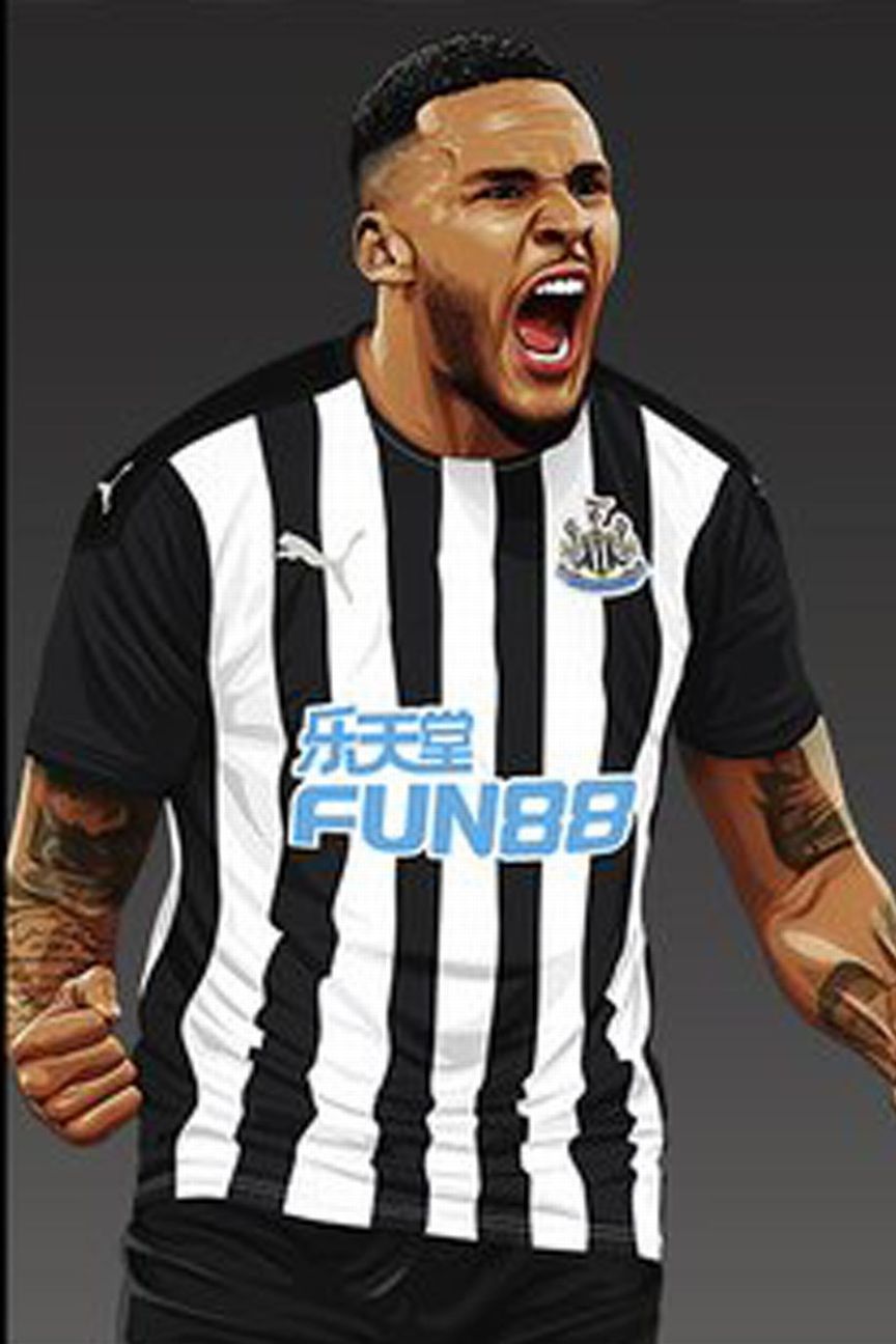
Newcastle’s traditional black-and-white vertical stripes, with all-black sleeves and no other embellishments, give the jersey a timeless if underwhelming look.
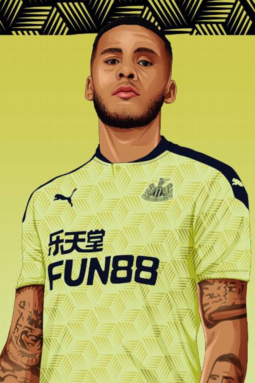
Things get more vivid as we delve deeper into the Magpies’ new wardrobe with a garish block of fluorescent yellow that we don’t expect to see break any sales records at the Newcastle club shop this season.

Newcastle’s third kit takes us down another level, with manufacturers Puma unleashing tessellated purple triangles and more flashes of that toxic yellow to launch a barrage our retinas.
Order Newcastle’s 2020-21 kits via the club’s official website
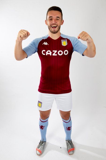
Just a generic, slightly clingy looking Villa jersey in claret with sky blue sleeves. It’s adequate and uninspiring: a bit like their 20219-20 Premier League season.
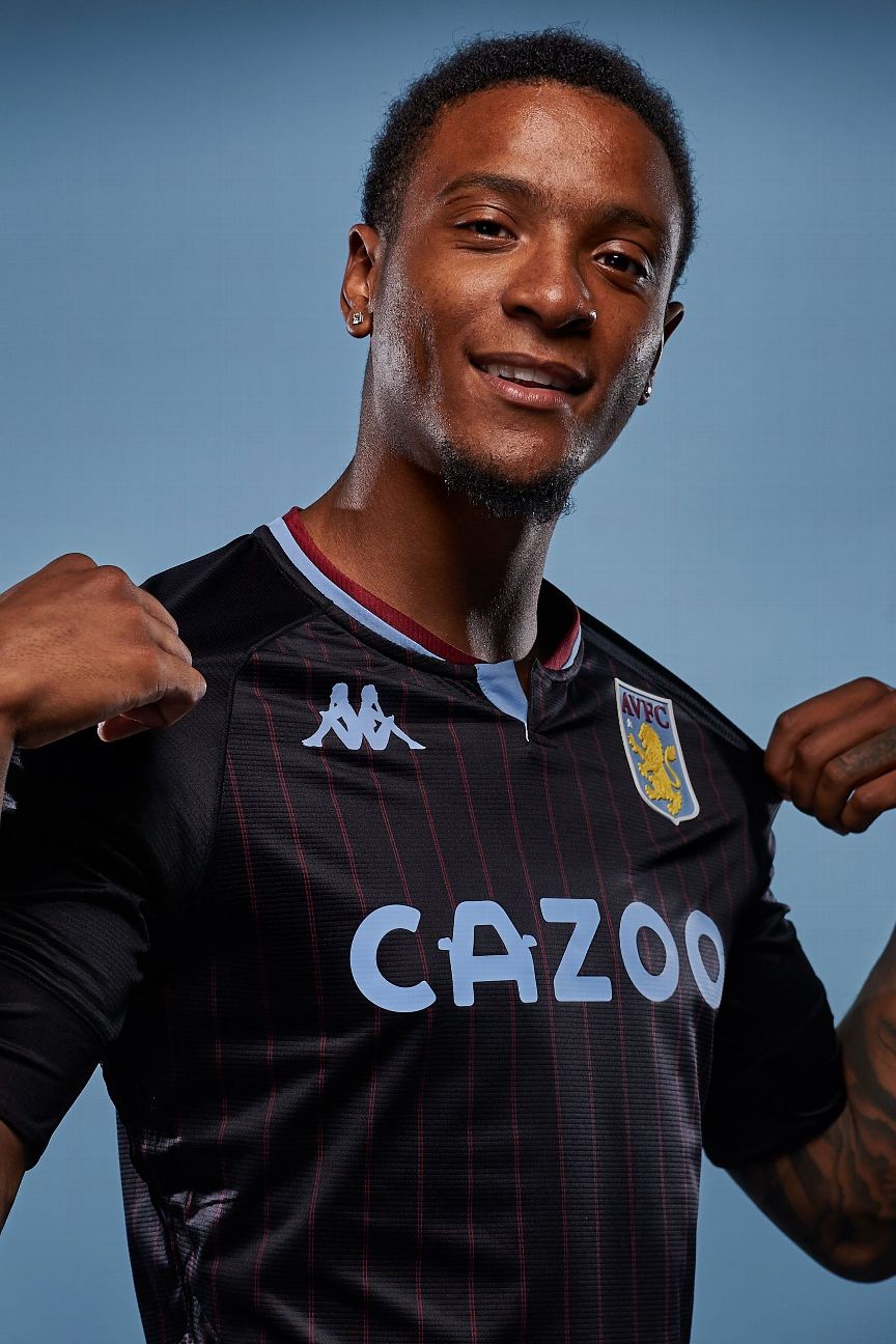
The away kit is little more interesting in terms of design, with fine claret pinstripes on an inky blue background and the two-tone collar affording it an air of class.
Order Aston Villa’s 2020-21 kits via the club’s official website
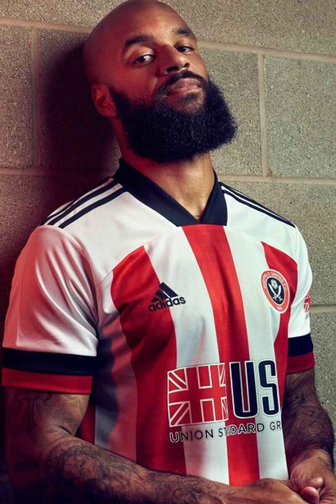
Honestly, you could tell us that this is last season’s Sheffield United shirt and we’d have no reason to doubt you.
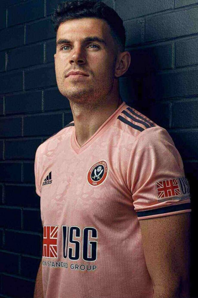
The colour is described as a “subtle light pink” but it looks like they were ice white until somebody accidentally washed them with the home jerseys on a high temperature.
Order Sheffield United’s 2020-21 kits via the club’s official website
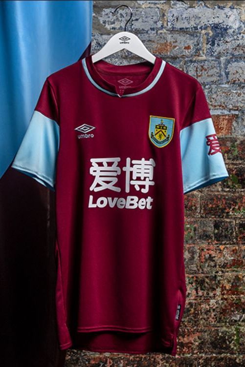
An homage to mark the 100th anniversary of the Claret’s revered 1920-21 league-winning side. Not the most eye-catching, but a balanced combination of classic and modern styles.
Away
The Clarets are yet to unleash their new away kit on an unsuspecting world…
Order Burnley’s 2020-21 kits via the club’s official website
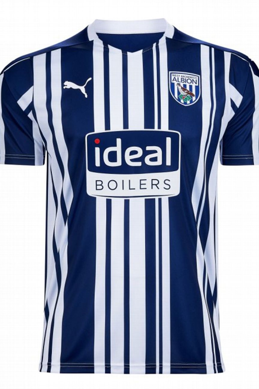
In an innovative plan to get customers whizzing through the checkouts at their club shop, the Baggies have cleverly included the barcode in the design for their new home shirt so you can just scan and go.
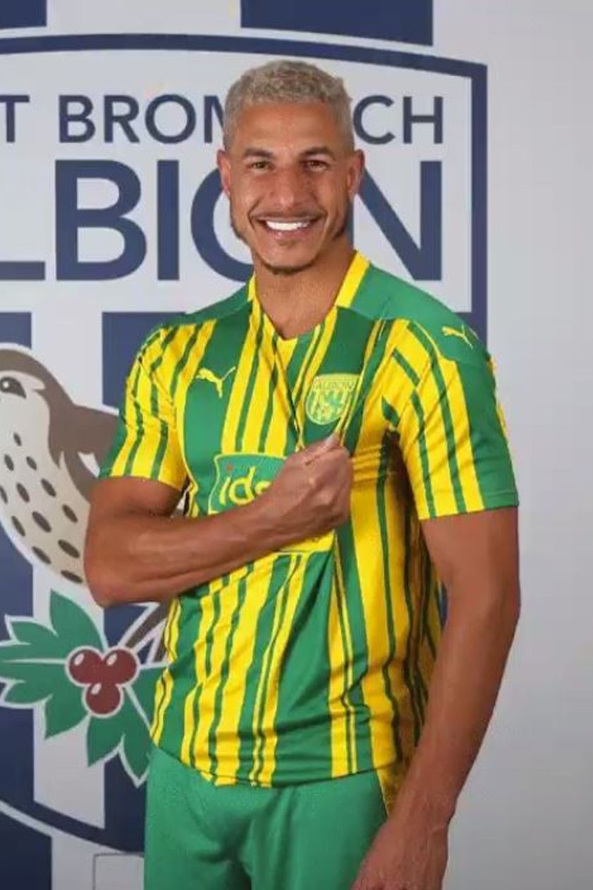
We appreciate that bright yellow and green are important colours in terms of Baggies history, but that doesn’t make this strip any easier to look at.

There’s something very “Ligue 1” about the Baggies’ third alternate shirt. We’re still not sure if that’s a good or a bad thing, though we’re edging toward the latter.
Order West Brom’s 2020-21 kits via the club’s official website
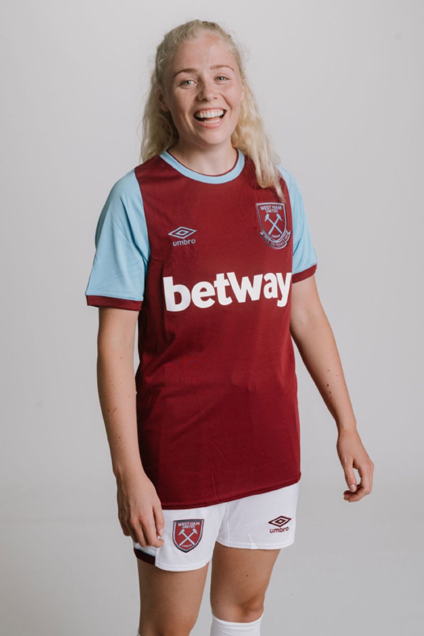
It’s perhaps fitting that West Ham should celebrate their 125th anniversary by not deviating from the tried and tested formula of their famous claret and blue colours.
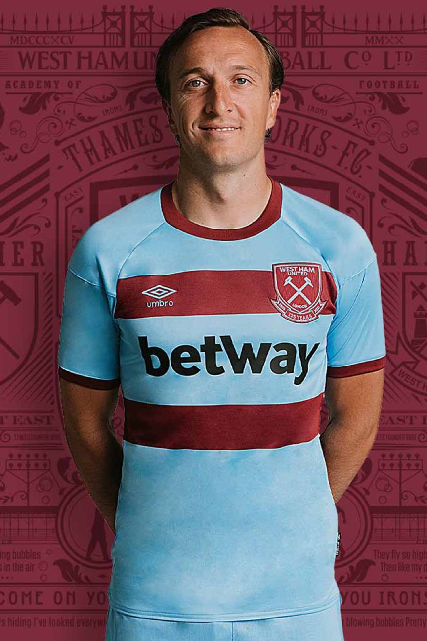
The away shirt is a little more interesting in terms of design, but then again we’re only really saying that to be polite.
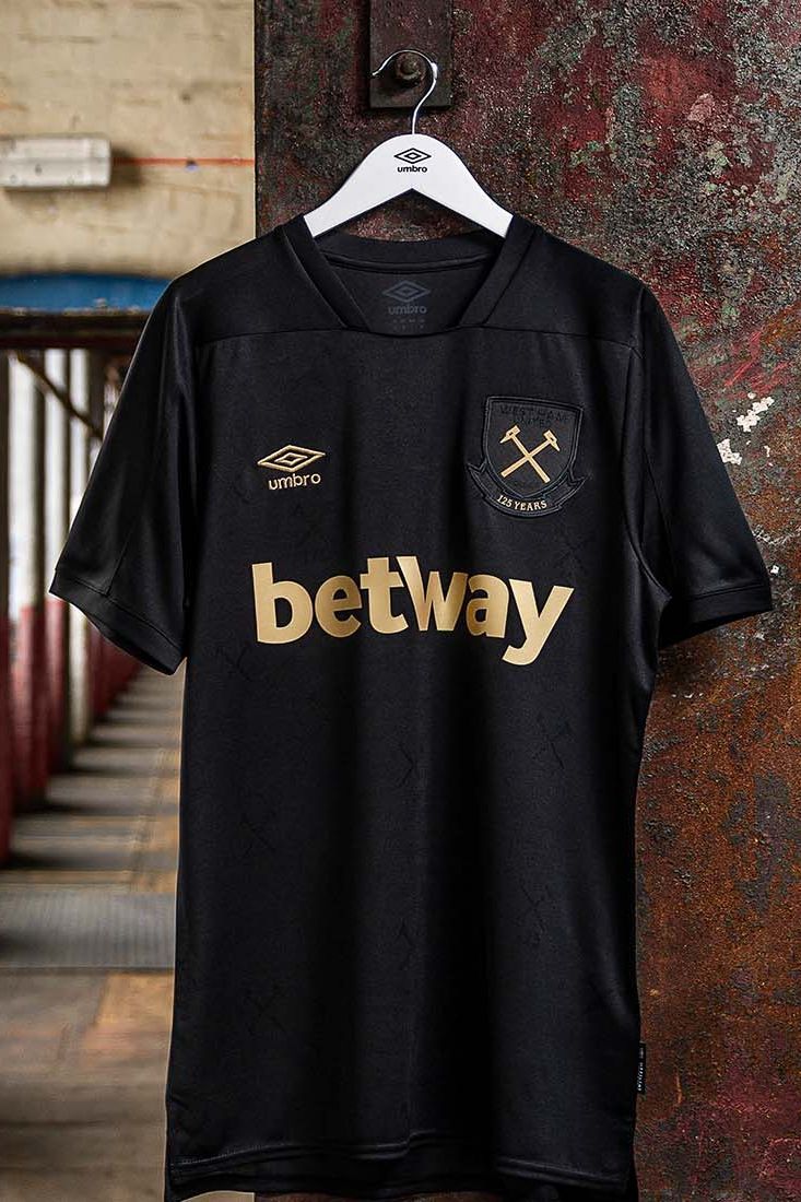
The Hammers are one of several teams to release black and gold away kits this season. Still, this one is also available to buy without the sponsor across the torso, so that’s a definite plus.
Order West Ham’s 2020-21 kits via the club’s official website
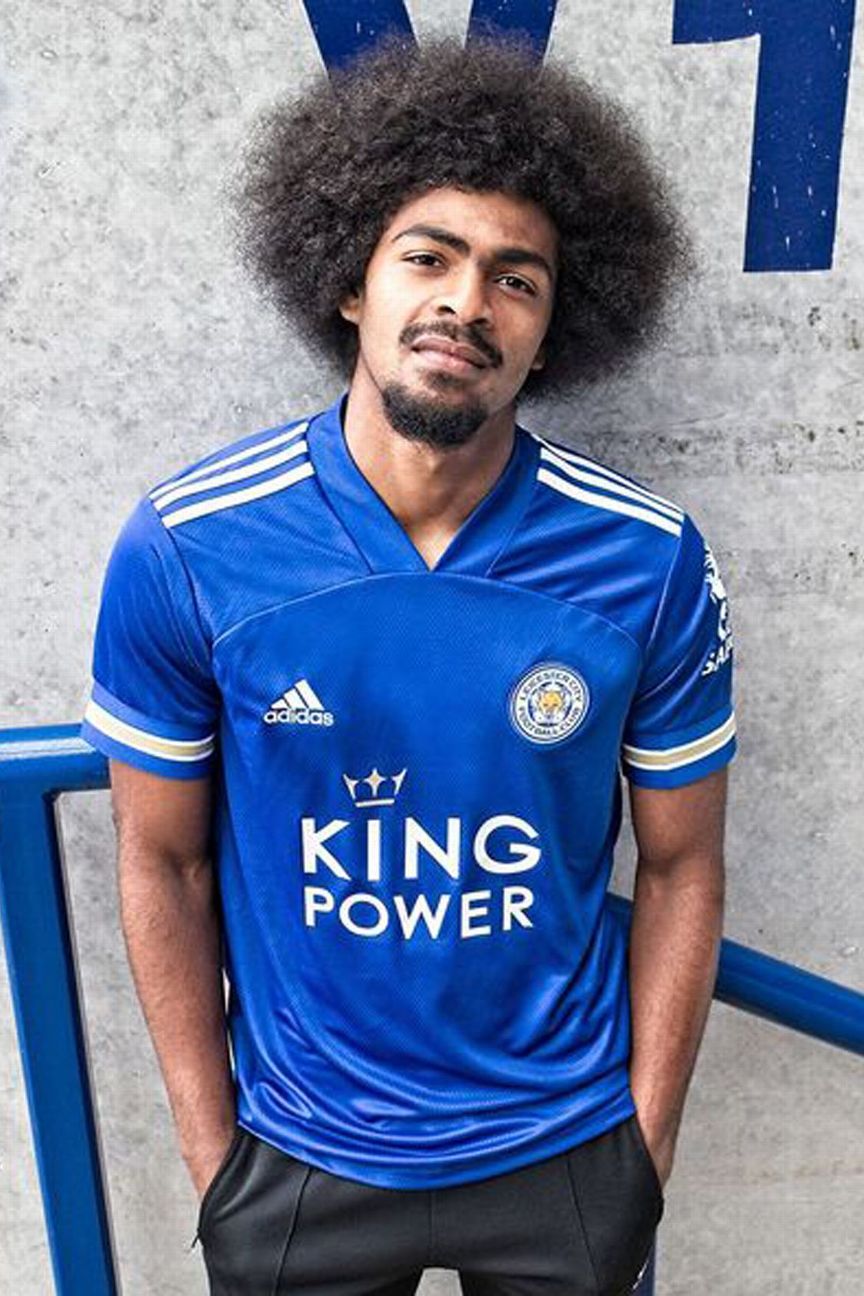
The Foxes are still proudly sporting that golden trim adopted after their miraculous Premier League title win in 2015-16, and who can blame them? Otherwise, their new home shirt is a bit of a mediocre template design.

To celebrate their return to European football, Leicester have also launched not one, but two away kits for 2020-21 — the first being a solid white shirt with gold trim.

The second away kit is a suave maroon number which looks less like a jersey to play football in and more as though it has been designed with the market for casual wear foremost in the mind.
Order Leicester’s 2020-21 kits via the club’s official website

Chelsea debuted their new home kit, a basic blue non-entity, toward the end of last season and so far it hasn’t been kind to them. On its first outing with the logo of new sponsor Three (a UK phone network) across the front, they lost 3-0 at West Ham. Christian Pulisic scored in the FA Cup final while wearing it, but the Blues lost to Arsenal with the U.S. forward limping off injured.
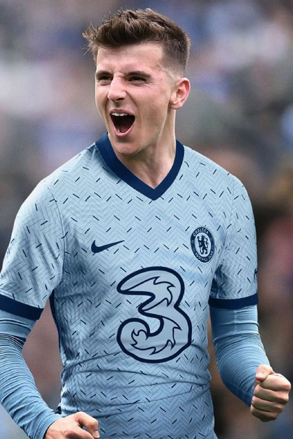
The away shirt, for all the promotional talk of “a classic tailored aesthetic” and “a modern street lens,” looks like a set of baby blue pyjamas.
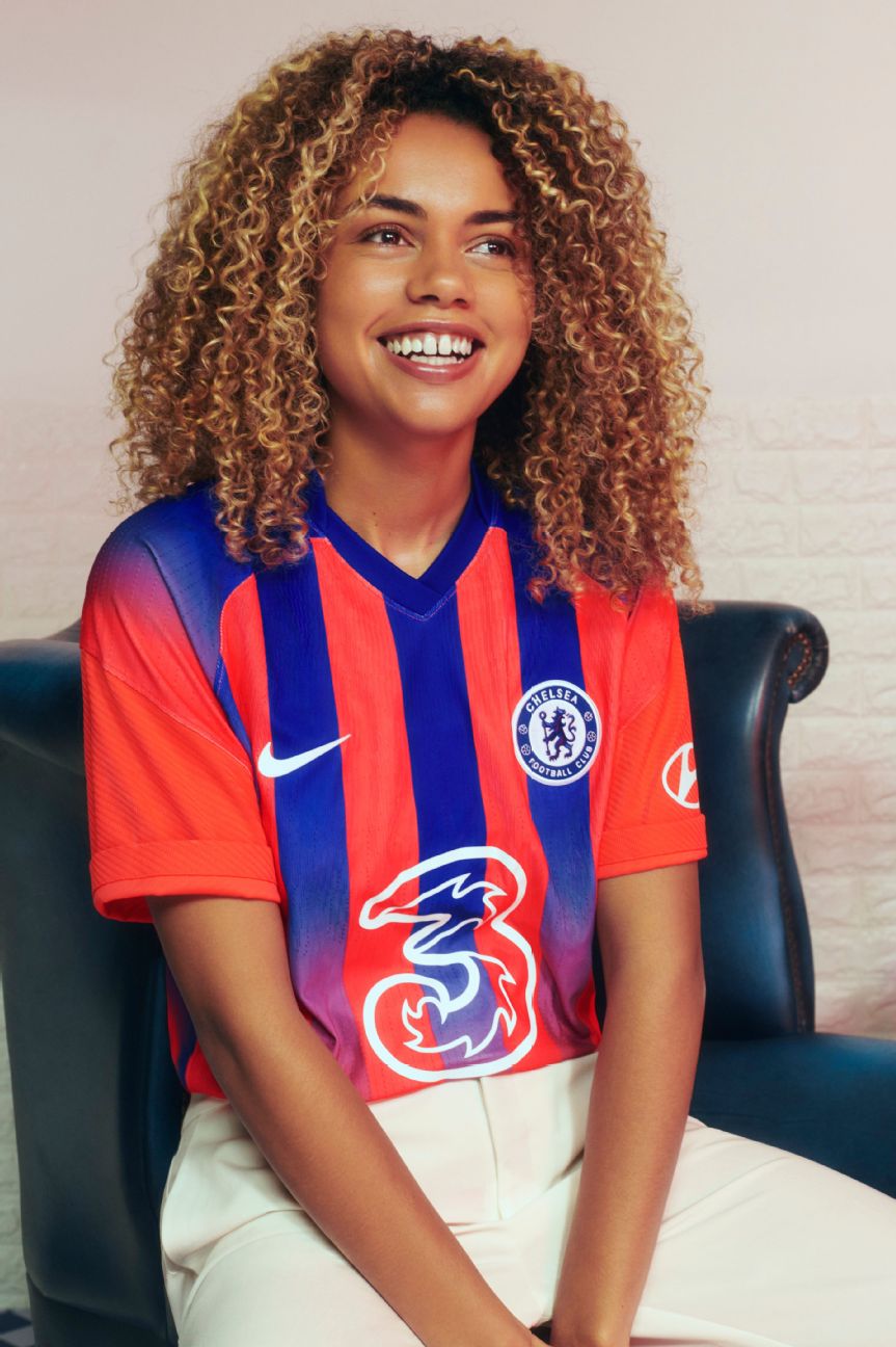
It’s hardly surprising that Crystal Palace were rendered aghast when Chelsea released their 2020-21 third shirt as it looks like the design was lifted straight from the Eagles’ reject pile. As with the infamous grey and orange monstrosity of 1994-95, there’s a sliver of cult potential.
Order Chelsea’s 2020-21 kits via the club’s official website
12. Fulham (Adidas)
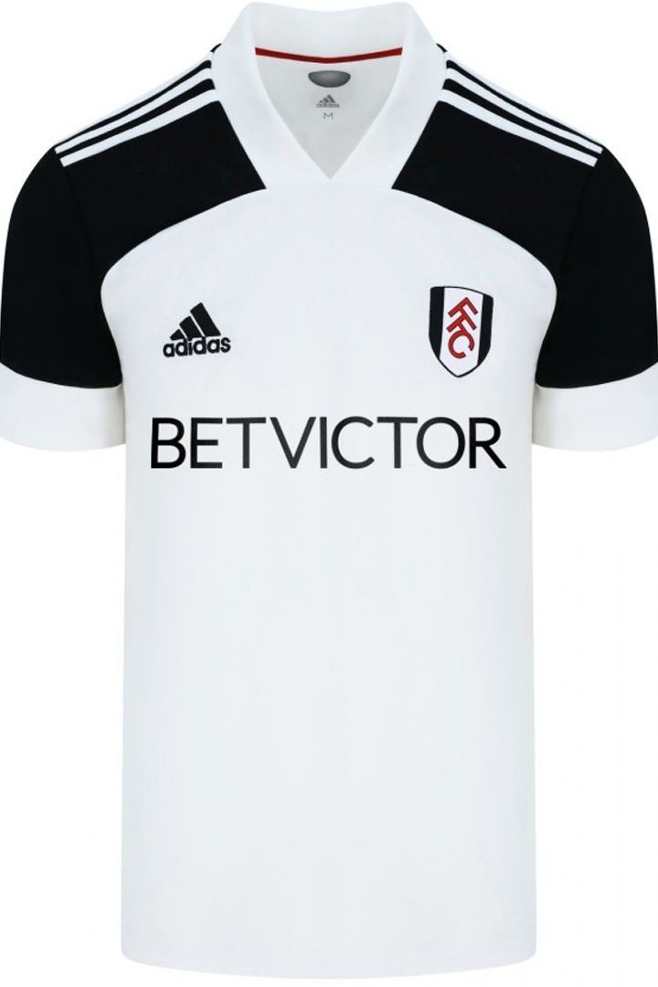
They took their time, releasing their new kits just days before they kick off their return to the Premier League. The broad black shoulder pads are reminiscent of the strip Fulham wore during their epic Europa League adventures under Roy Hodgson a decade ago, which is a nice touch.
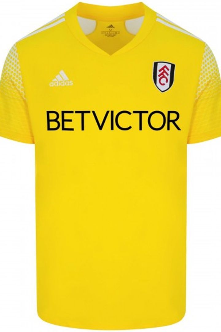
On their travels, Fulham will be adorned in matching bright yellow shirts, shorts and socks for the first time since the 2008-09 campaign, when they achieved their highest ever league finish (seventh) and secured their place in Europe for the following season.
Order Fulham’s 2020-21 kits via the club’s official website
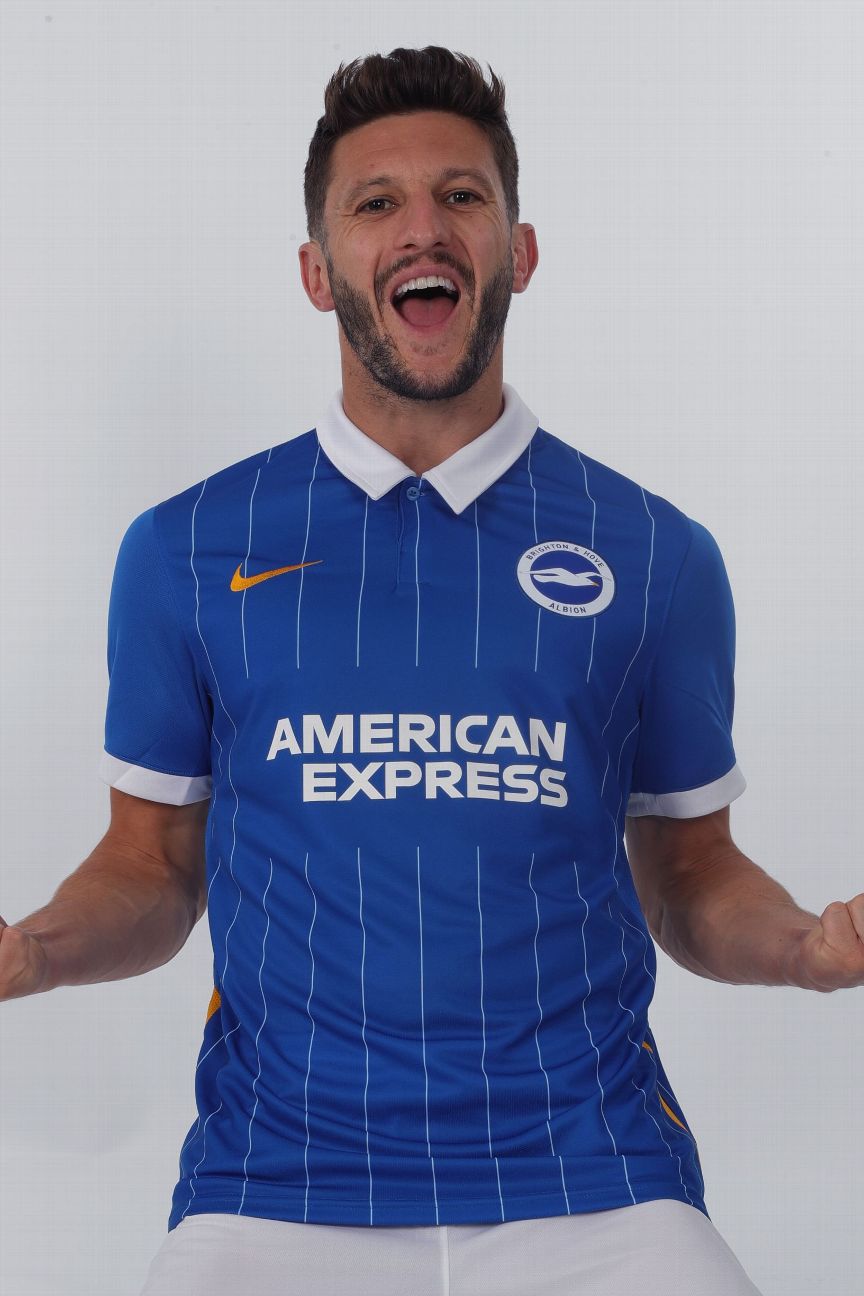
A classy pinstriped number with polo shirt collar inspired by previous Seagulls kits worn in 1983-84 and 1993-94. There’s a hint of nautical style about it, which is fitting for a club who play 10 minutes from the sea.

A partner piece to the new home shirt, though this time the 1980s-tinged design is mainly yellow with a bright blue overlapping collar.
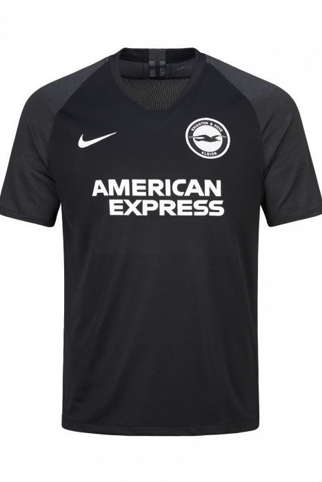
It’s black. Plain black. Head to toe. The sleeves are different texture, but the difference is barely noticeable. Still, it’s not terrible, and at least the club badge and sponsor logos are a different colour.
Order Brighton’s 2020-21 kits via the club’s official website

There’s nothing particularly wrong with Spurs’ new kits, per se — except that there is a distinct “first draft” vibe about them. The home shirt is white with chunky blue bands placed awkwardly just below each shoulder.

Another straightforward design, though the flashes of clashing neon help break the monotony. That said, we’re not sure we’ll ever get used to the sight of Spurs playing in green.

Inspired by both Spurs away shirts of yore and Nike’s classic Air Max 95 sneaker. It’s a plain yellow football kit. It looks more like a nice t-shirt that would go well with said footwear, rather than a sports kit.
Order Tottenham’s 2020-21 kits via the club’s official website
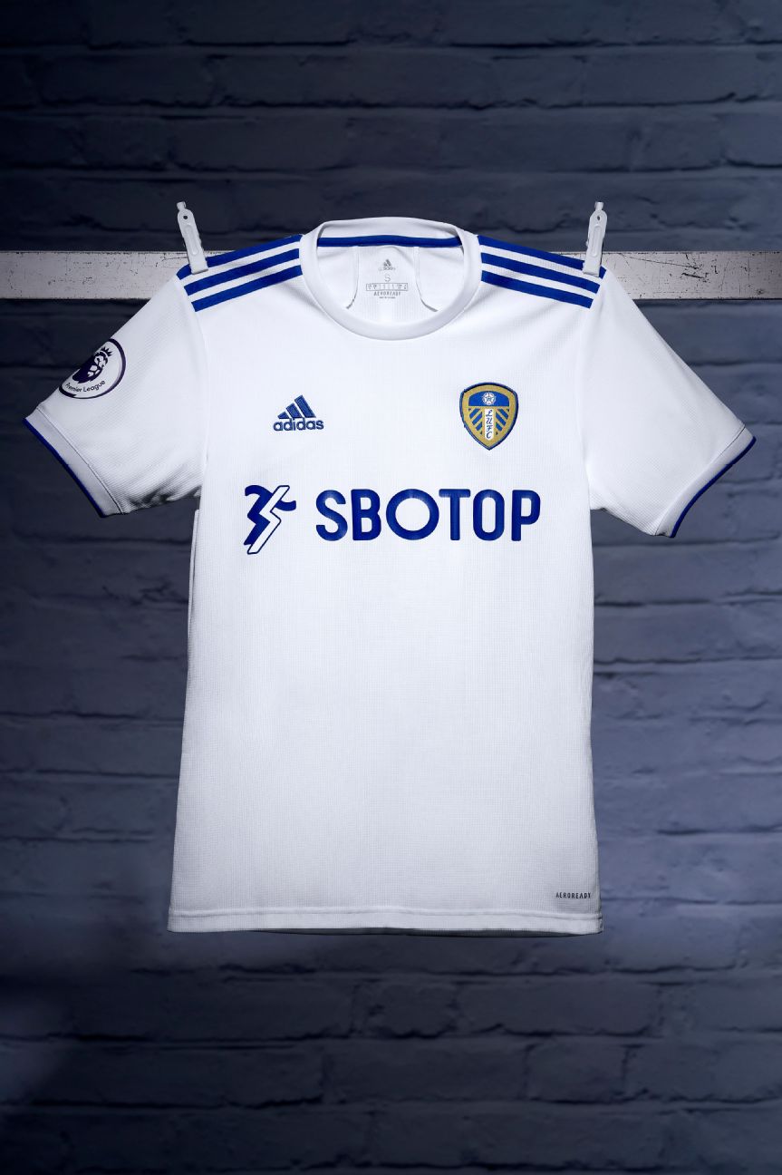
Leeds are back in the big time with a sharp new strip. The shirt they’ll be wearing on their return to the top flight is nice, but a little too plain to elevate it above the ordinary.

Reminiscent of their classic alternate kit of 1995-96, Leeds’ new away shirt instantly evokes memories of former striker and regular scorer of wonder-goals Tony Yeboah — which is never a bad thing. The official colours used are ‘legend ink’ and ‘mystery green’ which also adds a fantastical flourish to proceedings.
Order Leeds’ 2020-21 kits via the club’s official website

While United’s new strip may look to some like it’s made of material from a bus seat, the concept behind taking strands of thread from the club crest to create a mottled pattern is a good one.

Yes it’s another black change shirt for United but there’s something about the wavy print and silver trim, inspired by Manchester’s public transport network, that just gives it a modicum of sophistication.
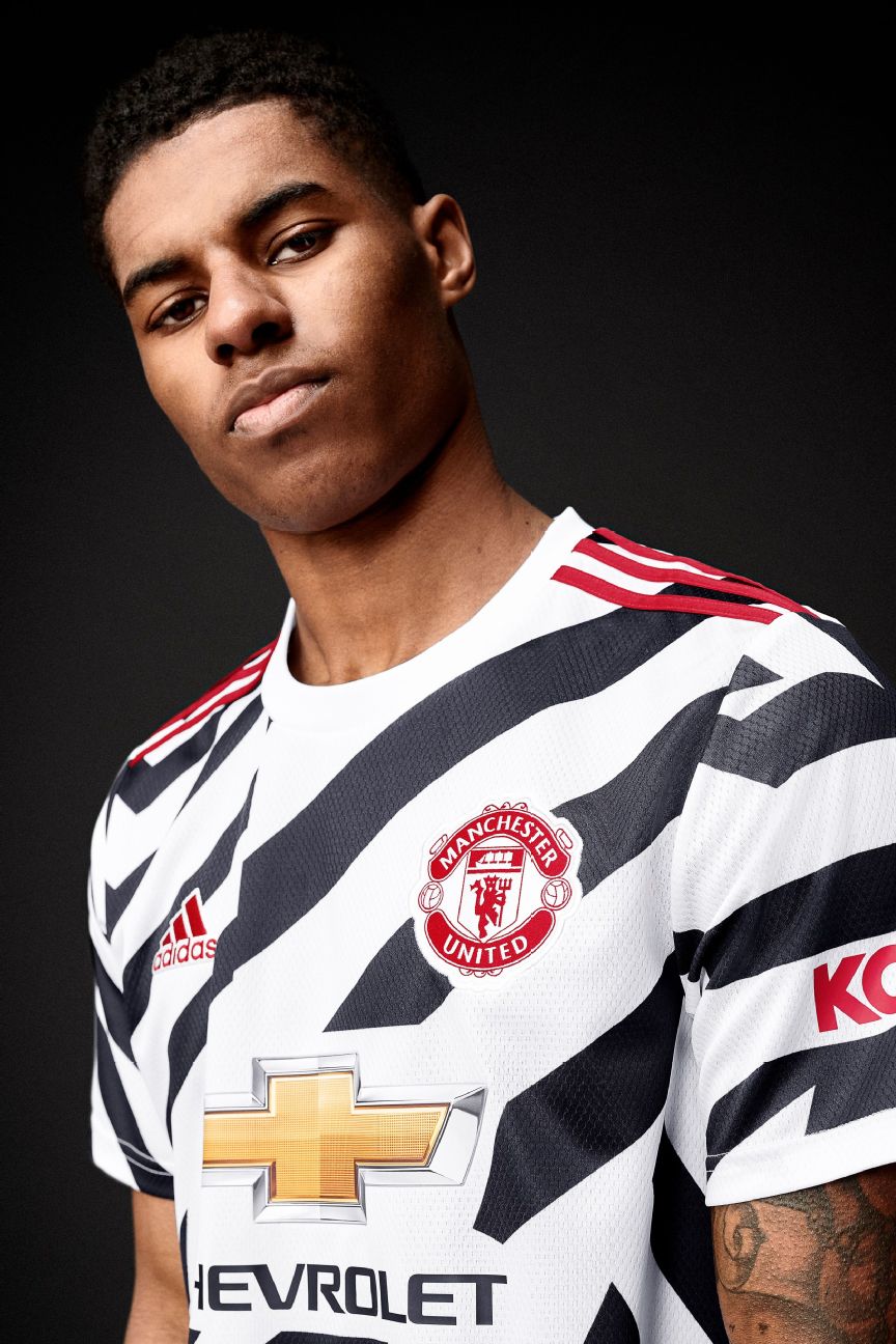
Designed as an homage to the first time United wore stripes in 1910 (the club’s first season at Old Trafford), David Beckham was enlisted to unveil it on his Instagram account — presumably in the hope that he, the world’s most handsome footballer, could make it look good. The reception has been mixed.
Order Manchester United’s 2020-21 kits via the club’s official website

Not to be confused with Chelsea’s new third kit, Palace have opted for a simple, unfussy re-jig of their famous red and blue stripes. The club’s fans would probably be happy with any new kit, just as long as Wilfried Zaha is wearing it for another season.
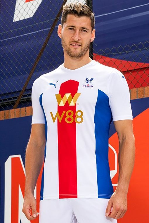
A variation on the theme of the home design, Palace’s away strip sees the broad stripes laid out on a crisp field of white for a perfectly prim jersey.
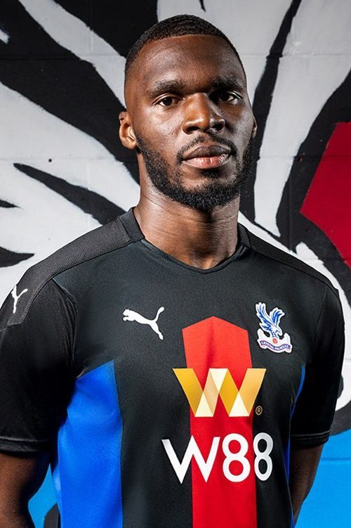
Much like Marge Simpson’s pink Chanel suit, Palace managed to coax a third iteration of the basic layout, proving that when manufacturers get their templates right they can be wonderfully versatile.
Order Palace’s 2020-21 kits via the club’s official website

Sleek and sophisticated, the 2020-21 iteration of Wolves’ famous “old gold” kit radiates an auric glow.
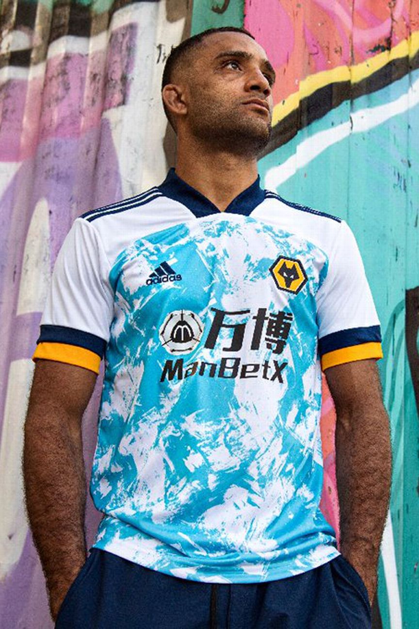
With the neon blue slime clashing with the navy and bright gold trim, it’s hard to make sense of Wolves’ away shirt. It’s weird that we don’t entirely dislike it either.
Order Wolves’ 2020-21 kits via the club’s official website

With the Saints set to celebrate their 135th anniversary next year, Under Armour have revived the classic sash first worn back in 1885. After all, who doesn’t love a sash?

This navy kit has flashes of yellow and “Solent” blue (named after the body of water that the port city is based alongside) in reference to the shirts worn by the Saints during their 1976 FA Cup final victory over Manchester United.
Order Southampton’s 2020-21 kits via the club’s official website
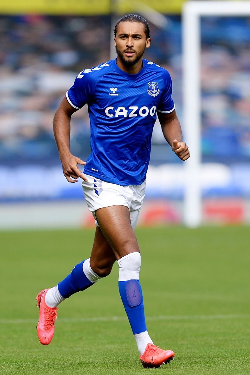
Trust new suppliers Hummel to serve up a warm batch of nostalgic goodness, with the Toffees’ chevroned home shirt bursting with 1980s appeal. Record sales on launch day seem to suggest that the fans are in favour, too.

The away kit is based in the same template, but bright amber with blue trim — inspired by the amber Alan Ball-era Everton away strips of the late 1960s.
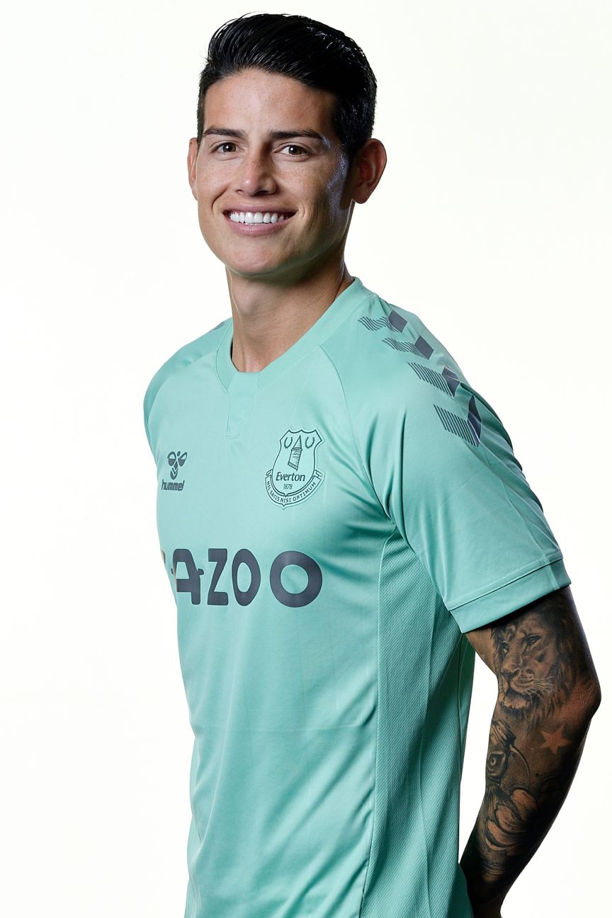
Mint and toffee is a delicious combination, although you could easily be fooled into thinking this is just Jordan Pickford’s goalkeeper jersey from last season.
Order Everton’s 2020-21 kits via the club’s official website

A throwback to the mid-1990s with chunky collar and teal trim, the Reds’ new home shirt is evocative of the club’s 1990s “Spice Boys” like Robbie Fowler, Steve McManaman and Stan Collymore. Let’s hope Jurgen Klopp’s players aren’t inspired to don cream Armani suits for their next cup final.
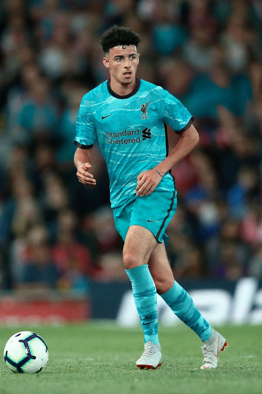
The vivid teal colour is a nod to the famous Liver Bird that watches over Liverpool from its perch atop the Liver Building, while the leafy abstract pattern is inspired by the Shankly Gates — in short, a surefire winner with Reds fans.
Order Liverpool’s 2020-21 kits via the club’s official website
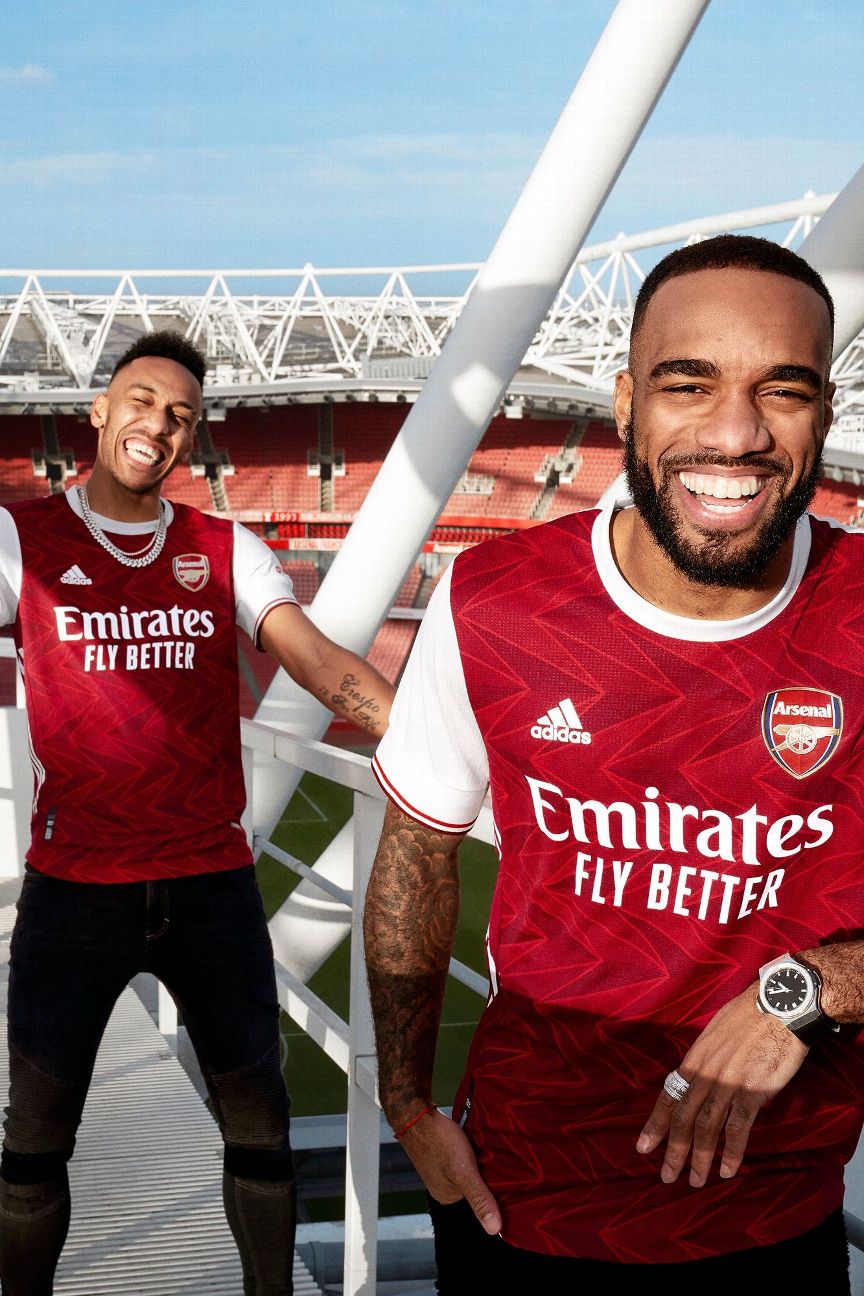
One of several clubs who have gone back in time for inspiration, the angular geometric pattern on the Gunners’ new home shirt is lifted from the “art deco” crest used on their kits between 1936 and 1949.
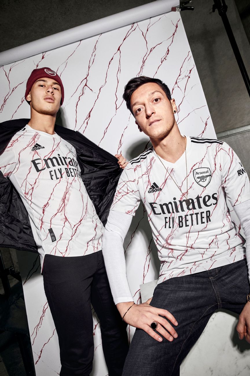
The accompanying away shirt is also inspired by the glories of the past, this time the grand marble entrance halls that awaited visiting dignitaries at Highbury, the club’s former home. The promo that launched it took kit reveals to a whole new level with it’s sweeping tour through an Arsenal-themed art gallery.
Order Arsenal’s 2020-21 kits via the club’s official website
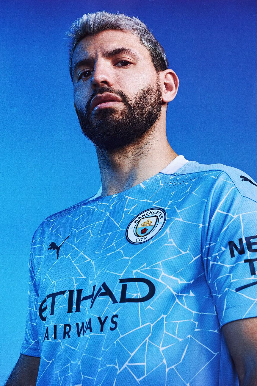
You have to hand it to City for trying something a bit different. Their new “cracked” shirt (inspired by the folk-art mosaics that decorate Manchester’s northern quarter) is a hit for us.
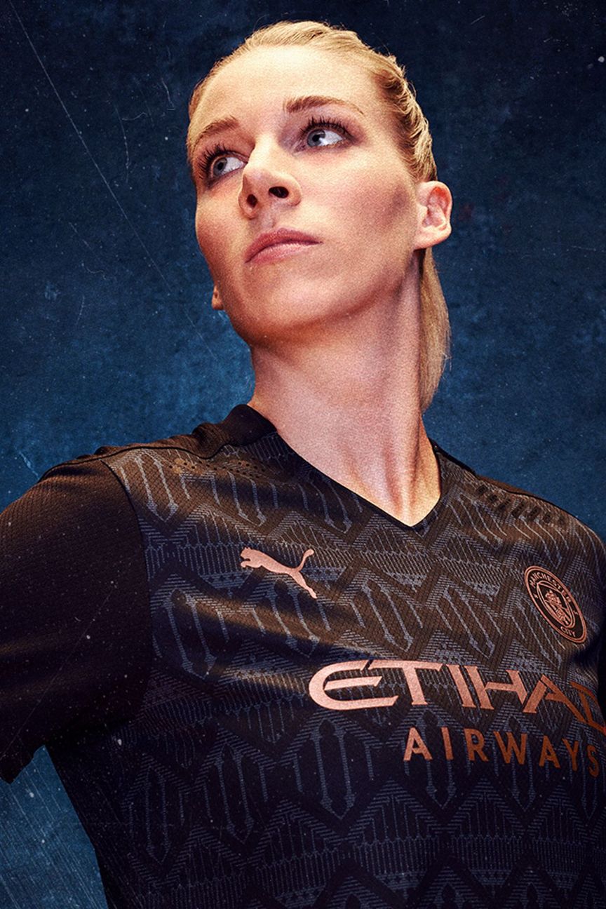
Suave and subtle, this jersey is layered with lovely details and is topped off with copper trim. City managed to produce this beauty despite taking inspiration for the design from the canals and railway bridges that run throughout Manchester.
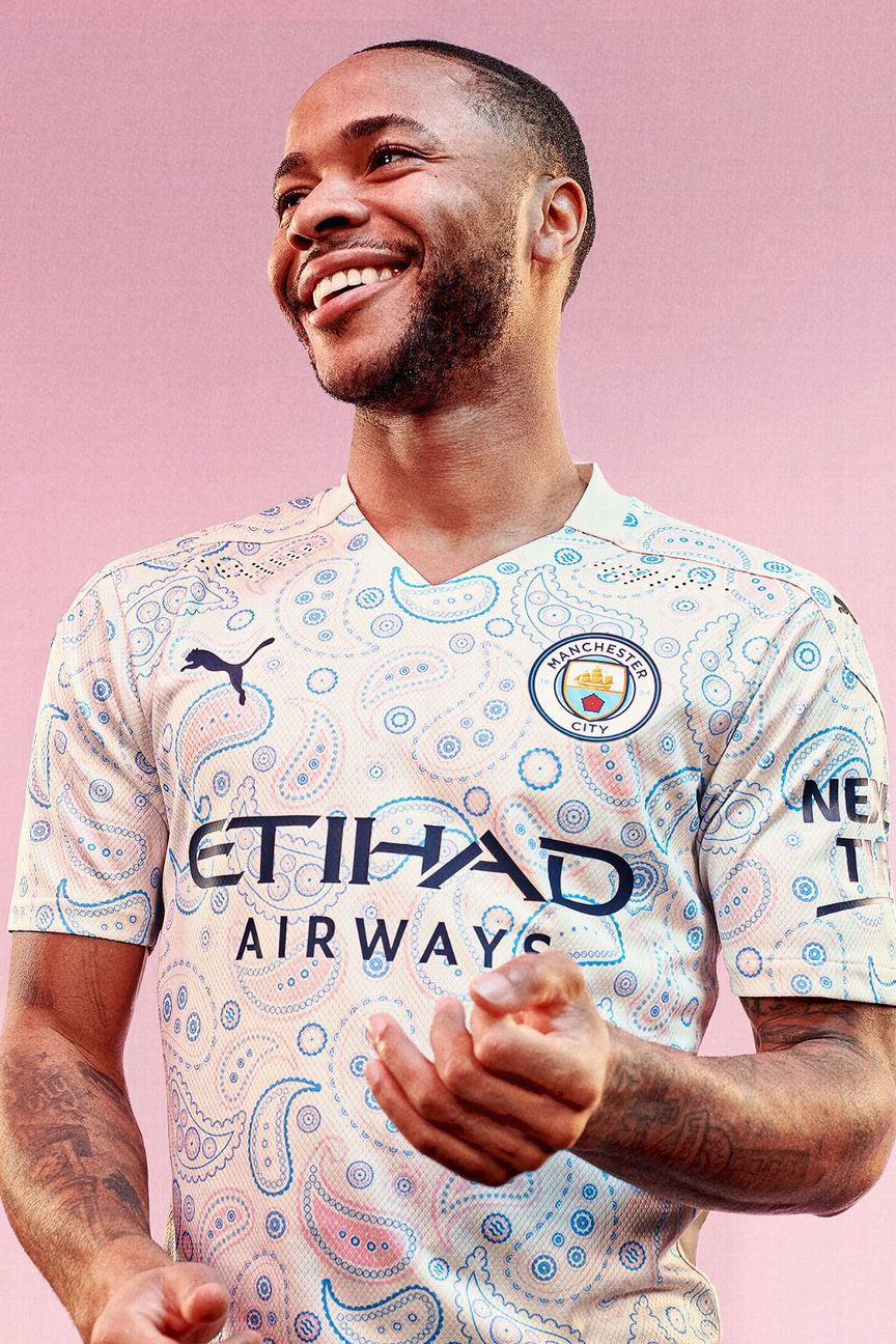
Who doesn’t love a bit of paisley? City’s trippy third shirt is a nod to Manchester’s musical heritage, from the 1960s all the way through acid house, the “Madchester” scene, to the Britpop and indie bands of the 1990s. Mad for it!
Order Manchester City’s 2020-21 kits via the club’s official website
